Ecommerce Integration Guide
This guide walks you through wiring the Fitit ecommerce surface — size finder, size table and virtual try-on — into your online store.
New to Fitit? Start with What is Fitit? for a 30-second overview of the ecosystem.
Integrating Fitit into your website is simple. Just follow these four steps:
- Add the script to the end of your page's
<body> - Add the buttons to your product detail pages
- Tag your product detail page elements with CSS classes and data attributes so Fitit can read the product info
- Configure Google Tag Manager and the
dataLayerfor ecommerce event tracking
For successful integration, make sure to:
- Place the script directly in the HTML body (not through Google Tag Manager)
- Include the
ft-hiddenclass on both buttons - Add the
<div id="fitit-app"></div>element exactly as shown - this is where Fitit mounts
Why the ft-hidden Class Is Required
The ft-hidden class is used to initially hide the buttons when the page loads. This is important because:
- When your page loads, Fitit makes a request to our database to check if the current product exists in our system
- If the product is available in our database, the buttons will automatically become visible
- If the product is not available, the buttons will remain hidden
This prevents showing size options for products that aren't integrated with Fitit. The system automatically handles this visibility toggle, but the ft-hidden class must be included for this functionality to work properly.
Heads up – no CSS import needed. Starting with Fitit v3, the widget renders inside a Shadow DOM and the script automatically injects every style it needs (both host styles and widget styles). You no longer need the <link rel="stylesheet" href=".../main.min.css" /> tag in your <head>.
Using an older version (v2 or earlier)? Keep the CSS <link> tag in your <head> — those builds still require it:
CSS (legacy versions only)
<link rel="stylesheet" href="https://cdn.fitit.ai/prod/latest/css/main.min.css" />
1. Add the Script
Copy and paste this code at the end of your <body> section:
HTML
<div id="fitit-app"></div>

<script defer type="text/javascript">
    window.fitit = {
      storeId: '<YOUR STORE_ID KEY>', // Replace with your actual store ID
      storeMode: 'MPA'  // Use 'SPA' if your site is a Single Page Application
    };

    let script = document.createElement('script');
    script.type = 'text/javascript';
    script.src = 'https://cdn.fitit.ai/prod/latest/js/main.min.js';
    script.id = 'fitit-script'
    document.body.appendChild(script);

    window.addEventListener('fititReady', () => {
      console.log('Fitit READY');
    });
</script>
To get your STORE_ID KEY, contact our team at integrations@fitit.ai or through support.
2. Add the Buttons
Add these buttons to your product detail pages:
Size Finder Button
HTML
<button id="fitit-button" onclick="window.fitit.login()" class="ft-hidden" fitit-button-text="Find My Size">Find My Size</button>
The label updates automatically. This button is dynamic:
- First visit / guest user: shows the default label (
fitit-button-text, or the value set in the admin panel — e.g. Find My Size / Saber mi talle). - Logged-in user with a size already recommended for this product: Fitit rewrites the button text to the recommendation, e.g. Your size is M. This happens automatically — you don't need to call any API or update the DOM yourself.
- User logs out or no recommendation is available: the original label is restored.
Fitit also preserves any <svg> icon you place inside the button and handles a loading state with its own spinner while the recommendation is being fetched, so feel free to use the button as a regular CTA in your design.
Size Table Button
HTML
<button id="fitit-size-table-button" onclick="window.fitit.openSizeTable()" class="ft-hidden">Size Table</button>
Virtual Try-On Button
HTML
<button id="fitit-tryon-button" onclick="window.fitit.openTryOn()" class="ft-hidden">Try On</button>
The Try-On button stays hidden until Fitit confirms that try-on images are available for the current product. Like the other buttons, the id, onclick and ft-hidden attributes must be kept exactly as shown.
3. Add Data Attributes and CSS Classes
To ensure Fitit works optimally with your product pages, add these CSS classes and data attributes to the corresponding elements on your product detail pages:
Adding these data attributes and CSS classes helps Fitit identify and analyze your product information more accurately, improving the size recommendation algorithm. Each element needs both the CSS class and the data attribute.
Product Detail Page Example
Here's how a properly integrated product page should look. Notice the numbered elements that correspond to the required CSS classes and data attributes:
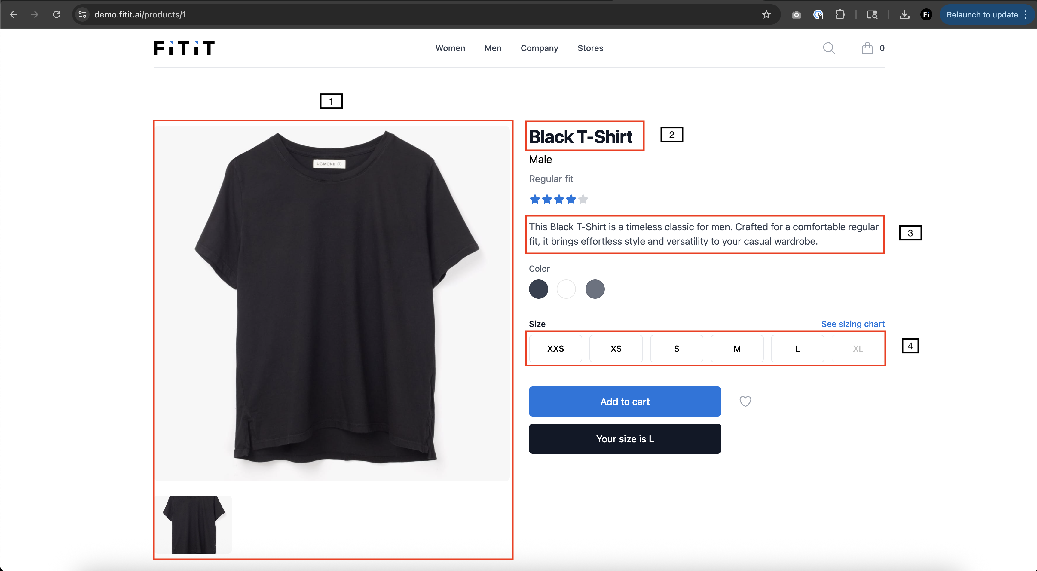
CSS Classes and Data Attributes to Add
Apply these CSS classes and data attributes to the corresponding elements on your product detail pages. Each element needs both the CSS class and the data attribute:
-
Product Images Container
- CSS Class:
fitit-images - Data Attribute:
data-fitit="images" - Example:
<div class="fitit-images" data-fitit="images">...</div>
- CSS Class:
-
Product Title Element
- CSS Class:
fitit-title - Data Attribute:
data-fitit="title" - Example:
<h1 class="fitit-title" data-fitit="title">...</h1>
- CSS Class:
-
Product SKU Element
- CSS Class:
fitit-sku - Data Attribute:
data-fitit="sku" - Example:
<span class="fitit-sku" data-fitit="sku">...</span>
- CSS Class:
-
Product Type Element
- CSS Class:
fitit-product-type - Data Attribute:
data-fitit="product-type" - Example:
<div class="fitit-product-type" data-fitit="product-type">...</div>
- CSS Class:
-
Product Brand Element
- CSS Class:
fitit-brand - Data Attribute:
data-fitit="brand" - Example:
<span class="fitit-brand" data-fitit="brand">...</span>
- CSS Class:
-
Product Price Element
- CSS Class:
fitit-price - Data Attribute:
data-fitit="price" - Example:
<div class="fitit-price" data-fitit="price">...</div>
- CSS Class:
-
Product Description Container
- CSS Class:
fitit-description - Data Attribute:
data-fitit="description" - Example:
<div class="fitit-description" data-fitit="description">...</div>
- CSS Class:
-
Product Colors Element
- CSS Class:
fitit-colors - Data Attribute:
data-fitit="colors" - Example:
<div class="fitit-colors" data-fitit="colors">...</div>
- CSS Class:
-
Size Selector Container
- CSS Class:
fitit-sizes - Data Attribute:
data-fitit="sizes" - Example:
<div class="fitit-sizes" data-fitit="sizes">...</div>
- CSS Class:
Styling the Buttons
Pick a preset that matches your store and click Copy Code to grab the ready-to-paste HTML for the Find My Size and Size Table buttons. The Try-On button uses your site's CSS the same way — you can apply any of these styles to it as well.
Elegant Black Style
High-contrast, uppercase, premium feel.
Fitit Branded Style (with Logo)
Dark CTA with the Fitit mark inline.
Minimalist Icon Style (Plain)
No background. Pure icon + text — for editorial layouts.
Whatever style you choose, keep the id, onclick and ft-hidden class on each button exactly as shown — those attributes are how the script finds, mounts and toggles the buttons. Everything else (colors, padding, fonts, icons) is yours to change.
Customizing the Widget from the Admin Panel
Many of the visual settings used inside the Fitit widget (the modal that opens on top of your site) are controlled remotely from the Fitit admin panel — you don't have to redeploy your site to change them.
Sign in to app.fitit.ai and go to Settings → Script to configure:
| Setting | What it controls |
|---|---|
| Script logo | The logo shown inside the Fitit widget header. |
| Fitit button text | Default text/label used by the #fitit-button (e.g. "Saber mi talle", "Find My Size"). Can be overridden per-button with the fitit-button-text attribute. |
| Table description | The description shown above the Size Table view. |
| Primary color | Main brand color used for buttons and accents inside the widget. Maps to the --ft-color-primary CSS variable. |
| Secondary color | Accent color for subtle elements inside the widget. Maps to --ft-color-secondary. |
| Border radius | Border rounding for buttons and cards inside the widget. Maps to the --ft-border-radius* variables. |
| Display font | Font used for headings and prominent text inside the widget (--ft-font-display). |
| Body font | Font used for body copy inside the widget (--ft-font-body). |
| Font URLs | Google Fonts (or compatible) stylesheet links loaded automatically so your chosen fonts are available inside the widget. |
These settings affect the Fitit widget UI that renders inside the Shadow DOM (the size finder, size table, and try-on flows). The buttons you placed on your own product page (#fitit-button, #fitit-size-table-button, #fitit-tryon-button) keep using your site's own CSS — only the fitit-button-text value is pulled from this panel.
Changes saved in the admin panel are picked up on the next page load — no code change is required.
Advanced: Injecting Custom CSS Inside the Shadow DOM
Because the Fitit widget renders inside a Shadow DOM, CSS from your site does not reach the widget. The admin panel covers the most common theming needs (colors, fonts, radius, logo, button text), but if you need finer-grained control — for example replacing an asset, tweaking a specific element, or applying brand-specific overrides — you can inject your own stylesheet directly into the shadow root.
The pattern is:
- Wait until
#fitit-appexists and has ashadowRootattached. - Append a
<style>tag with your custom CSS to the shadow root. - Use an
idon the<style>tag so the helper doesn't re-inject it on every tick (and you can update/remove it later).
Custom Shadow DOM styles
<script>
  function injectFititStyles(css) {
    const interval = setInterval(() => {
      const el = document.querySelector("#fitit-app");

      if (!el || !el.shadowRoot) return;

      if (el.shadowRoot.querySelector("#fitit-custom-style")) {
        clearInterval(interval);
        return;
      }

      const style = document.createElement("style");
      style.id = "fitit-custom-style";
      style.innerHTML = css;

      el.shadowRoot.appendChild(style);

      clearInterval(interval);
    }, 100);
  }
</script>

<script>
  injectFititStyles(`
    #fitit-upload-guide-image-t-shirt {
      background-image: url('/img/remera-elburgues.jpeg') !important;
    }
  `);
</script>
This is an escape hatch for advanced cases. The internal selectors, IDs and class names of the Fitit widget can change between versions without notice, so any override you ship here can break after a Fitit release. Whenever possible, prefer the admin panel and the public CSS variables (--ft-color-primary, --ft-color-secondary, --ft-border-radius*, --ft-font-display, --ft-font-body) over targeting internal selectors directly.
SPA tip. On single-page apps the script may re-attach #fitit-app after a route change. Call injectFititStyles(...) again whenever your app navigates to a product detail page (or wrap the call in your router's navigation hook) to make sure the custom styles are present.
4. Google Tag Manager Requirements
Before connecting Fitit through Google Tag Manager, make sure the store meets the following requirements.
GTM is used here for ecommerce event tracking — Fitit reads view_item, add_to_cart and purchase events from your dataLayer. The Fitit script itself should still be added directly to your HTML <body> as shown in step 1, not loaded through a GTM tag.
1. Google Tag Manager must be installed and active across the ecommerce flow
The store must have an active Google Tag Manager container installed and published in production.
The GTM container must be loaded on all pages or screens where Fitit needs to track ecommerce behavior, including:
- Product detail pages
- Add-to-cart interactions
- Cart / checkout flow, when applicable
- Order confirmation / thank-you page
The container should be visible in the browser network requests as:
https://www.googletagmanager.com/gtm.js?id=GTM-XXXXXXX
Please note that Google tag IDs such as GT-XXXXXXX, G-XXXXXXX or AW-XXXXXXX are not the same as a Google Tag Manager container.
Fitit's GTM integration requires a real GTM container, identified by a public ID in this format:
GTM-XXXXXXX
2. Ecommerce events must be pushed to the dataLayer
Fitit reads ecommerce events from the store's dataLayer.
The store should push events using:
dataLayer push
window.dataLayer = window.dataLayer || [];
window.dataLayer.push({
  event: "event_name"
});
Recommended standard ecommerce event names are:
view_itemadd_to_cartpurchase
If the store uses custom event names, they can be mapped during the Fitit setup.
For example, if the store sends:
Custom purchase event
window.dataLayer = window.dataLayer || [];
window.dataLayer.push({
  event: "orderPlaced",
  ecommerce: {
    transaction_id: "T_12345",
    value: 72.05,
    currency: "USD",
    items: [
      {
        item_id: "SKU_12345",
        item_name: "Product name",
        price: 72.05,
        quantity: 1
      }
    ]
  }
});
then the Fitit event mapping should be configured as:
purchase → orderPlaced
The mapped event name must match exactly the value sent in the event field.
3. Standard purchase dataLayer example
For purchase tracking, the recommended dataLayer structure should follow the standard Google Analytics ecommerce format:
Standard purchase event
window.dataLayer = window.dataLayer || [];
window.dataLayer.push({
  event: "purchase",
  ecommerce: {
    transaction_id: "T_12345",
    affiliation: "Online Store",
    value: 72.05,
    tax: 3.60,
    shipping: 5.99,
    currency: "USD",
    coupon: "SUMMER_SALE",
    items: [
      {
        item_id: "SKU_12345",
        item_name: "Stan and Friends Tee",
        item_brand: "Google",
        item_category: "Apparel",
        item_category2: "Adult",
        item_category3: "Shirts",
        item_variant: "Green",
        price: 29.99,
        quantity: 1
      },
      {
        item_id: "SKU_12346",
        item_name: "Google Grey Women's Tee",
        item_brand: "Google",
        item_category: "Apparel",
        item_category2: "Adult",
        item_category3: "Shirts",
        item_variant: "Grey",
        price: 42.06,
        quantity: 1
      }
    ]
  }
});
Minimum required fields for purchase tracking:
eventecommerce.transaction_idecommerce.valueecommerce.currencyecommerce.itemsecommerce.items.item_idecommerce.items.item_nameecommerce.items.priceecommerce.items.quantity
4. Custom event mapping
If the ecommerce platform does not use the standard GA4 event names, configure the custom event names in the Event Mapping section of the Fitit admin panel.
Example:
| Fitit event | Store dataLayer event |
|---|---|
view_item | view_item |
add_to_cart | add_to_cart |
purchase | orderPlaced |
The value must match the exact event value pushed to the dataLayer.
For example, if the store sends:
Store purchase payload
window.dataLayer.push({
  event: "orderPlaced",
  ecommerce: {
    transaction_id: "123456",
    value: 800,
    currency: "UYU",
    items: [
      {
        item_id: "SKU_12345",
        item_name: "Product name",
        price: 800,
        quantity: 1
      }
    ]
  }
});
the purchase mapping should be:
purchase → orderPlaced
Not:
purchase → purchase
because the store is not pushing an event called purchase — it is pushing an event called orderPlaced.